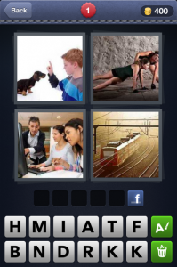
 I’ve recently become enamored with the game Four Pictures One Word. I find myself glued to my iPad, typing in the word that all four pictures represent. Mostly I answer correctly, which is good for my self-esteem. But, what I really like about the game is the simplicity of visuals telling me a one-word story.
I think public relations people often struggle with visuals. We use words to conjure up an image in people’s minds. And with these words we like to write sentences that flow through a thoughtful process of storytelling that, unfortunately in today’s time of split second attention spans, can drift off the page to fallen ears.
The phrase “A picture is worth a thousand words” is attributed to an advertising guy, Frederick R. Barnard, who published a piece in Printer’s Ink in 1921 commending the effectiveness of graphics in advertising. The ad folks have capitalize on this thought for ages and, for the most part, do a good job catching our attention with visuals. But ads convey simple thoughts. Public Relations people are often challenged with communicating complex thoughts. And this is why we often get hung up with spewing out a lot of words.
Incorporating more visual images with written narrative can help simplify the message and create “aha” moments for your readers more quickly and emotionally.
Here are four tips to get you started:
1. Keep it Simple. While it can be helpful to use the talents of a graphic artist or photographer to help you with visuals, sometimes a simple chart that you create in PowerPoint is all you need to convey a key message. As complicated as Congress can be, they are masters of using simple posters in presentations. A red line moving up on a graph can communicate a single thought about spending, for instance, that connects with the listener no matter how complex the reasoning is behind it.
2. Draw it out yourself. If you have a complex, or dry topic to communicate, take out a blank piece of paper and draw a picture of what it looks like. Use stick figures, boxes, circles, arrows – it doesn’t matter and you don’t need to be an artist. Simply going through this process will accomplish two things. It forces you to break topics apart into simple chunks, and it gives you a blueprint to give to a graphic artist who can take your doodles and turn them it into great visuals to help you communicate your message.
3. Don’t stereotype your audience. You might be targeting an audience of moms, but do not assume that your visuals need to be cookies and children. Moms want to know the hard facts too and a pie chart may just be the right visual. At the same time, a presentation to a business audience filled with data driven images will even put the most ardent accountant asleep. Babies and quirky graphics can shake things up and get the attention of your business crowd.
4. Write as if you are tweeting. While the visuals will bring your message to life, the words – or even better, the word, you use – can be just as powerful. Supporting each visual with a succinct message that resonates with your audience is important. Try to write the message as if you only had 140 characters to use. Now, take this message and pretend it is communicated through four different pictures, like my Four Pictures, One Word game. What is the one word that links these pictures together? This exercise will help you bring your verbiage down to more salient points that can stick with the attention deprived reader and listener we deal with today.
How are you including visual images in your public relations communications. I’d like you to share your ideas.
