
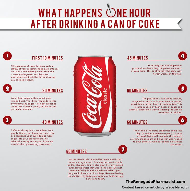
Did you see it? Last week, an infographic claiming to show what happens to your body within the first hour of drinking Coca-Cola tore across the internet like wildfire. Created by blogger The Renegade Pharmacist including statistics from this BlissTree article, it featured claims such as: at “45 minutes: Your body ups your dopamine production, stimulating the pleasure centers of your brain. This is physically the same way heroin works, by the way.”
Well, if the earlier mention of “10 teaspoons of sugar” hadn’t caught your attention, the heroin reference sure did.
Clearly, this infographic isn’t exactly an ad for a refreshing can of Coke. And the accuracy of the content has been criticized more than a few times (see here and here), but that’s not what I want to talk about.
There’s a ton of science about why infographics and visuals are such effective ways to convey information. According to the SAGE Handbook of Political Communication, it only takes one tenth of a second to process visual information—that’s 60,000 times faster than it takes for the brain to decode text. We know that they work, and that’s why we use them.
So what’s the problem?
When we break data down into these “easily digestible” pieces of information, it’s easy to oversimplify. As with the Coke example, snippets of information are presented without much (if any) context, and that’s where we start to see issues. Every time we share that link without reminding ourselves that technically, your brain also releases dopamine every time you work out, we let those readers believe that by drinking a can of Coke, they’re buying into a habit as dangerous as drug use. (All you health nuts, work with me here and set aside the fact that no matter what, 39 grams of sugar in one serving probably isn’t good for you).
Finding that balance can be even more of a challenge in an industry like healthcare. The messaging we’re working with is often complex and it’s tempting to scale it back to the highest level, in hopes of making it easy to understand.
How can we create infographics with responsible, standalone content? Try asking yourself the following questions about each of the individual statistics:
- Does it make sense? If someone were to pull this statistic from your infographic without having any background information, is your message clear?
- Is it accurate? This may seem obvious, but it’s easy to drop important details when we try to make content easy to read.
It’s pretty straightforward, but you’d be surprised how much this can help. Take a few extra moments to evaluate each statement on its own and see where you end up!
Who’s doing it well? One of my favorites is The Dangers of Online Self-Diagnosis, by Insurance Quotes. Check it out. You’ll see that each piece can exist by itself, and gives enough information to properly inform the reader without being overwhelming.
Which brands do you think are creating the best infographics? I’d love to hear what you think – share in the comments below!